Why Two Similar Runners Need Different Training
One of the most common questions I get is:
“If two runners have similar fitness, shouldn’t they train the same way?”
On the surface, it makes sense. Similar race goals. Similar mileage. Similar threshold numbers. That’s exactly the logic behind the countless pre‑made endurance training plans available online.
But real athletes aren’t templates.
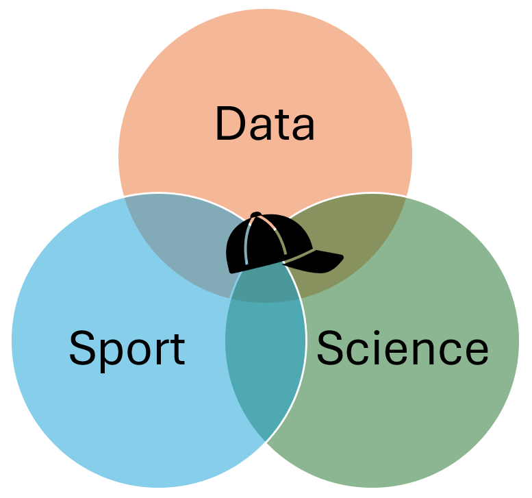
Toolbox Of A Coach
The goal is simple in principle but complex in practice: to increase the accuracy of coaching decisions and improve the overall process outcome.
What endurance coaching can learn from AI‑supported workflows
One of the most persistent assumptions in endurance training is that athletes with similar numbers should train in similar ways. Similar thresholds. Similar mileage. Similar race goals.
That assumption is the foundation of most pre‑made marathon plans available online.
But it’s also wrong.
Recently, I worked with two marathon runners, Mike and Dave who looked almost identical on paper. Both were experienced. Both were aerobically strong. Both had very similar threshold power values. If they’d downloaded a generic plan, they’d have followed the same sessions, week after week.
Instead, their training deliberately diverged.
From Raw Data to Structured Insight
My coaching process is built around repeatable analysis workflows, supported by AI. The goal isn’t automation for its own sake and it certainly isn’t replacing coaching judgement. It’s about reducing noise, bias and inconsistency when interpreting complex performance data.
Rather than scrolling through charts and reacting intuitively, I follow a defined hierarchy:
- Power‑duration curve
- Aerobic vs anaerobic contribution
- Performance trends over time
- Training load context
- Training behaviour and distribution
AI plays a supporting role here. It helps cross‑check interpretations, surface patterns and translate physiological signals into clear training implications. The decisions remain human, the workflow just makes them faster and more consistent.
This is the same principle used in good engineering systems: structure first, interpretation second.
What the Charts Revealed
Power-Duration Curve
This chart shows the maximum power an athlete can sustain across different time durations, from seconds to hours. Rather than focusing on a single metric like threshold, it reveals how fitness is expressed across the entire performance spectrum.
the power‑duration curve becomes more than a chart. It becomes a map of physiological constraints and opportunities
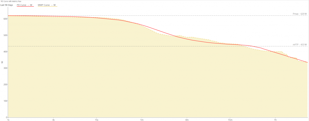
Two athletes can share similar threshold values yet display very different curve shapes highlighting differences in aerobic ceiling, durability and fatigue resistance. These differences are what drive individualised training decisions.
Interpreted within a structured workflow, the power‑duration curve becomes more than a chart. It becomes a map of physiological constraints and opportunities, guiding which training stimuli will be most effective and which should be avoided.
Once Mike and Dave were analysed through this workflow, the differences became obvious.
Mike showed a higher aerobic ceiling. His VO₂ related power was well expressed and his physiology could tolerate surges and late‑race changes in intensity. His limiter wasn’t fitness, it was converting that ceiling into durable marathon performance.
Dave, by contrast, was exceptionally stable. His threshold sat closer to his aerobic ceiling and his aerobic contribution dominated very early. He was durable, consistent and metabolically efficient but slightly “closed” at the top end.
Same race. Similar thresholds. Different physiological constraints.
Why Training Stimulus Matters More Than Training Volume
This is where template plans fail.
A generic marathon plan might prescribe the same intervals, the same long runs and the same taper for both athletes. But the charts told us something more nuanced:
- Mike needed durability‑focused work to convert his ceiling into late‑race performance
- Dave needed small, carefully placed VO₂ micro‑doses to open his ceiling just enough to make marathon pace feel easier
Neither needed “more fitness.” They needed different stimuli.
Those decisions didn’t come from intuition alone. They came from structured chart analysis, supported by AI to ensure nothing important was missed.
Why This Approach Scales Better Than Templates
Pre‑made plans are attractive because they’re simple. But simplicity often hides assumptions:
- That all thresholds behave the same
- That mileage equals durability
- That intensity affects everyone equally
In reality, performance is shaped by how power is produced, how it changes under fatigue and how training stress accumulates over time.
Modern tools allow us to see this clearly. AI allows us to process it efficiently. But the real value comes from how those tools are embedded into a workflow, not from the tools themselves.
This is coaching as a system, not a collection of sessions.
The Takeaway
AI doesn’t replace coaching. It sharpens it.
By combining structured workflows, performance modelling, and AI‑supported interpretation, I can spend less time searching for patterns and more time applying them, designing training that fits the athlete in front of me, not an average runner on the internet.
Mike and Dave didn’t need different plans because they were different people. They needed different plans because their physiology demanded it.
That’s the difference between following a template and being coached.